
.gif)
Here is a way to create charts from JavaScript libraries such as echarts directly on Text Areas
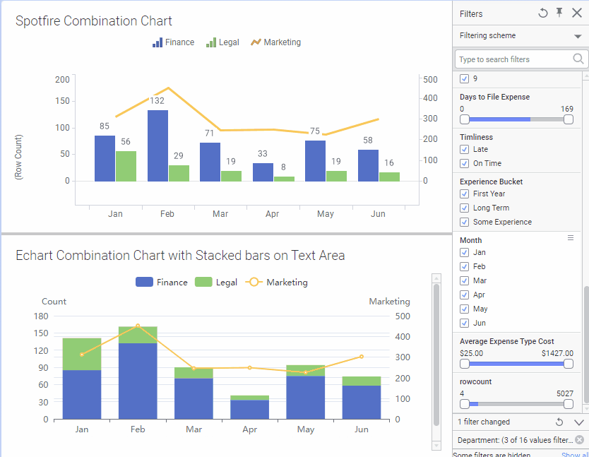
This example shows a Combination Chart with Stacked bars
- Create a Text Area and add the following HTML code and save the text area
<pre id="observed" hidden >
<span class="xaxis" >Jan, Feb, Mar, Apr, May, Jun</span>
<span class="yaxis" style="name:Finance;type:bar;stack:x;yAxisIndex:0">
Apr:33, Feb:132, Jan:85, Jun:58, Mar:71, May:75
</span>
<span class="yaxis" style="name:Legal;type:bar;stack:x;yAxisIndex:0" >
Apr:8, Feb:29, Jan:56, Jun:16, Mar:19, May:19
</span>
<span class="yaxis" style="name:Marketing;type:line;stack:y;yAxisIndex:1" >
Apr:248, Jan:312, Jun:302, Mar:245, May:225
</span>
</pre>
<div id="container" style="height: 100%"></div> - Copy the code from echarts.5.3.3.min.js and paste it onto a new Spotifre JavaScript
- Add this other JavaScript code as a new eChartTest.js file:
//script parameters
dataDiv = "observed"
chartDiv = "container"
//chart options
options = {
tooltip: {trigger: 'axis',axisPointer: {type: 'cross'}},
legend: {},
xAxis: [{type: 'category'}],
yAxis: [{
type: 'value',
position:'right',
name:"scale 1"
},{
type: 'value',
position:'left',
name:'scale 2'
}]
};
var dom = document.getElementById(chartDiv);
var myChart = echarts.init(dom, null, {
renderer: 'svg',
useDirtyRect: false
});
var app = {};
var option;
if (options && typeof options === 'object') {
myChart.setOption(options);
}
//monitor input changes (connect data with chart dirven by calculated values)
var observed = document.getElementById(dataDiv)
var trigger = function(){
xData = observed.querySelector(".xaxis").innerText.split(", ")
yAttr = {}
series=[]
yAxis = [...observed.querySelectorAll(".yaxis")].forEach((aYAxis) => {
yDatum={}
aYAxis.innerText.split(", ").forEach(p=>{
y=p.split(":");
yDatum[y[0].trim()]=y[1].trim()
})
yData = xData.map((c,i)=>{return yDatum[xData[i]]})
aYAxis.getAttribute("style").split(";").forEach(p=>{
y=p.split(":");
yAttr[y[0].trim()]=y[1].trim()
})
yAttr.data = yData
series.push({...yAttr})
})
let newOptions = {xAxis:[{data:xData}],series: series}
myChart.setOption(newOptions)
}
mutationObserver = new MutationObserver(trigger)
mutationObserver.observe( observed , {attributes:!true, subtree: true, childList: true} ); - To make the chart respond to marking from other visuals or filters, replace the hard coded values from step 1 with a Calculated Values to produce the same output. Example of calculated value:
for x axis:
UniqueConcatenate([Month])
for y axis:
UniqueConcatenate([Month]&":"&count() over (Intersect([Department],[Month]))) - Data comes from the Sales and Marketing sample analysis

1 comment:
Hello Leandro,
The example works up to step 3 just to make sure it works on your environment. There was a typo on the html. I forgot to add spaces after each coma on the xAxis. If you follow these 3 steps, you should see a graph.
Step 4 is a little tricky. You can unhide the id=observer pre tag by removing the hidden attribute: <pre id="observed") to debug the values. Make sure the values have no formatting such as $123,456.78 but must show as 123456.78
You can use any database. I am using the "Sales and Marketing" analysis from the examples that comes with Spotfire
You can also use the stock analysis example and use the following expressions to compare different ticker prices per year from the "fundamentals" data table
xAxis: UniqueConcatenate([Year])
yAxis: UniqueConcatenate([Year] & ":" & sum([EPS]) over (Intersect([Year])))
Add as many yAxis with the same expression and filter each calc value with some ticker
for example. limit data using expression: [Ticker]="AOS"
This approach works well for simple stuff. If you are on Spotifre 11+ is best to use Spotfire Mods.
Post a Comment